Before and After #7: Visual Unity
Before
|
After
|
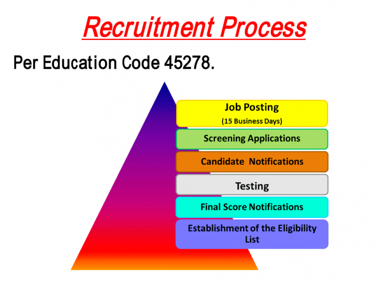
In this module, the principles of constructing a unified graphic design were introduced. A unified design, according to Malamed, is one in which the organization and graphical elements are coordinated with one another. I felt that the original image on the left did not make good use of this principle. I found the design to unclear. The pyramid shape in the background would suggest that the information be read from bottom to top, as the bottom of pyramid typically supports the top of the structure. However, it is clear that the information should be read from the top to bottom, creating confusion in the overall design. In my improved design, I attempted to present a much stronger message by creating a unified design. The steps of the process are clear to follow, and the use of complimentary colors creates an overall organized graphical presentation.
| Original Image |
| After Image PSD file |
